2006-04-09

Motorola Phonebooks: Just barely adequate

Many of you probably own some wireless Motorola product - most likely one of their mobile phones such as their ubersuccessful V3 RAZR, V600 and similar phones.

The software they run is pretty much identical between them all with their very own Motorola-esque interface that have frustrated many, yet still being used by more people than you would imagine.

Why? Style and Features.

In addition to in-demand features like EDGE data transfer, Bluetooth and speakerphones, I've got to admit that the style of Motos top-end phones is pretty good which doesn't make you wonder why so many people buy them. Not only is the exterior of the V3 gorgeous in all of its simplicity, but the colour screen is to die for. Really.

When purchasing a mobile phone, some people look for features, others for style, and some (like me) for general usability.

Fortunately people like me do not make up a large percentage of their target market, otherwise they would sell millions of units one week only to come victim to an equal percentage of customer returns the following week.


PRODUCT RETURN FORM

Customer Name: Alex Kovach
Product Manufacturer: Motorola
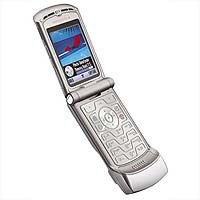
Product Model: V3 RAZR (But really damn near all others)
Reason for return: Worst. Phonebook. Ever.


You might ask yourself why I'm so anal about something so simple as a phonebook.

The reason: phones with all of these features, and styles such as this don't come cheap. The RAZR at the time that I bought it for example was $300. Not the most expensive but far from the cheapest.

If I'm going to pay money like that for a product, I would expect it to function at least as good as all others, if not better. In the case of the Motorola phones however, they perform far, far worse with respect to the phonebook (ONLY the phonebook).

Why should I settle for something that would clearly irritate me for every day that I own the product when there are many other manufacturers to choose from? Nokia phones for example (Series 40 specifically) are extremely intuitive to use and quick. Menu options are where you expect them to be and if you're ever wondering if you can do [this], and do it [here], then you probably can.

And the reason it bothers me? Laziness. How could a company as large as Motorola not realize how poor their product is in comparison to others? If you can clearly see the deficiencies in your product, why would you not do everything to make it better, and perhaps have YOUR product be renowned for its ease of use as well as style?

Why is the Moto phonebook so bad?


The Phonebook

For a very long time, although other manufacturers changed to more usable methods, Motorola still had each of your contact numbers as a separate entry.

In other words, if Mom can be reached at home, work, and her mobile phone, you would have three separate Mom entries: Mom (Cell), Mom (Work), Mom (Home).

The method chosen by other manufacturers was a single contact entry with multiple numbers per entry, so you would have one entry "Mom", and three numbers associated to that contact. It is really hard to believe why one would do it any other way.

To top it all off, the poor user of the Moto phone (current model lineup) would be prompted to select a memory location of where they would want to store a new number they're entering.

Hmmm memory location... You mean speed dial? Nope. Memory location.

Why would anyone care about that? They wouldn't. That's my point.

I had a Samsung phone that did that too and that's partly what annoyed me for the life of the phone amongst other award winning interface decisions.

----

Finally, with the RAZR they've waddled into the 21st Century and implemented the one-contact, multiple-entries solution.

Well... sort of. Once again Motorola stumbles on something that could have been done so well.

First of all, the default setting of the phone is to have separate contact entries for your numbers à la 1995. Only due to my curious nature am I able to notice the option to group your contacts together.

So, is this it? Have they nailed it? No. They haven't.

---

Let's say you meet someone at a business function. And let's assume that since this is Canada their name is probably not going to be John Smith, but something of a more international flavour that may not be the easiest for most lazy North Americans to spell.

You get their email addresss and phone number, store those in your phone under their name and agree to get back to them. You'll meet up eventually, have lunch, exchange business cards and so on.

Looking at the business card now it's clear that you've misspelled their name - so it's not John Ayzerbomb, it's John Aizserbaum.

No problem, not everyone's perfect. I'll just edit their contact information.

Oh, wait a second. So the phone will let me edit the contact info for their email, OR the contact info for their number? Well isn't it the same? Wouldn't that be the whole purpose for grouping these two details together?

Motorola user interface design experts obviously think otherwise.

Let's pick one at random.


OOoh... The phone number. What luck!

Click Edit --> Contact Name. I correct the name and click Save Entry.

Fabulous job... until you realize that the name for the phone number has changed yet the name belonging to the email address is still buggered. Great design guys.

---

Aside from the phonebook let's take a look at profiles.

A lot of phones nowadays (it used to be only Nokias) will let you have various profiles stored in the phone: Meeting, Outside, Silent, etc. so you don't have to manually adjust your ringer volume under those circumstances. Selecting a profile can change a lot more than the volume alone and takes much less time to do.

Have you ever wondered when you're in a theater, and at least one mobile phone owner can be heard adjusting his volume?


"BRRRIING, BRING, Bring, bring, brn"


Yes. That's a Motorola.

I suppose I should be commending them on even having profiles in the phone at all. Especially since they're even assigned clever names like: Low Ringer, High Ringer, and High + Vibe.

And to select between them all you have to do is adjust your volume control! Awesome!

Nothing says job well done than the Moto design team getting profiles on their brand spanking new V3 RAZR... the epitome of mobile style for Hollywood and most of fashion conscious North America.

Lotus Notes - Wondertool Numero Uno

Yes I'm still alive and well but with my schedule filled with various school projects and going to work I haven't been blogging lately. Due to recent experiences at work however I thought I'd let you in on some insider information regarding an unfortunate choice most companies have made for their email solutions.

Most people should think of MS Outlook, Thunderbird or other decent email applications before even considering Lotus Notes as a solution to their email needs.

I myself have chosen to the GMail route for personal use since I find the interface is great, although not the most efficient at times, grouping your conversations together and generally responding quickly to user actions.

But let's get back to Lotus Notes, and why I hope nobody ever has to use this horribly bloated mess of an application whose user-interface experts must have been away on vacation during its development.

First of all, the WHY.


Why would anyone even bother with it? Well, in my case the company I work at uses it so I don't have a choice. I can't think of any other reason anyone would subject themselves to its psychological torture.

Why am I bothered by it so much?


Usability Blunder #1

I write an email and send it off - let's say I included a 10mb project document and sent it to Joe Swanson, Ubergenius. I also sent carbon copies (for those of you who haven't figured out what "Cc" means) to my project team.

Joe responded to my message (also using Notes) and has unfortunately selected the Reply-To-All-With-History option.

Silly, Joe. Will he ever learn?

There's a multitude of reply options in the wondertool that is Lotus Notes:
  • Reply will not include any history at all
  • Reply-with-History resolves that but includes all original attachments in the reply. Why anyone would want to do this on a regular basis is beyond me.
  • Reply-without-Attachments is available yes, but since it's the last option on the menu it seldom gets noticed nevermind selected.

And yes, those options are duplicated for the dreaded Reply-To-All feature.

So the attachment I sent Joe has now been sent back to me as well as the 15 people in the Cc list.

Thanks, Joe for assassinating the mailbox storage limit for my whole project team.


Usability Blunder #2

Respond to an item in your "sent Items" and Notes cleverly decides that the recipient should be none other than yourself: the initial sender of the message.

SURELY if you want to reply to any email you want to reply to the sender, right? Sheesh, even Gmail got this one right and it hasn't been around for long at all. I can just imagine how many years this application has butchered such a simple function.


Usability Blunder #3

Lotus Notes has a side bar on the left side of the screen that can hold your bookmarks to address books and other databases (everything in Notes is basically a database).

I can't be positive, but most people would think if you have a bookmark set to point to a certain database that's most likely what you expect it to run when you click on it.

Well folks, in the world of Notes it's a different world. Of course it will work when you initially set it up, but there have been countless times where that very bookmark that I've clicked on about 40 times this morning to run my database development project now decides to point to another database.

Hmmm ok. Well maybe the design is the same? No, it's a completely different filename in a completely different location with a completely different design.

Let's try directly opening the file I was working on before then, that should work.

Oh, it doesn't. Well it does in a way, but unfortunately I'm not satisfied with running a backup version of the database that I made about 3 weeks ago. I'd rather run the one that I've put about 50 hours of work into since, thank you.

I don't change a thing, and get back from a much needed coffee run.

Clicking on the icon now points to the proper database again.

Magic!


Usability Blunder #4

Wow, the storage limit of my mailbox is really getting up there.

Around the time I get a warning before sending any outgoing mail out is when I start going through my existing items and saving/removing attachments I didn't have a chance to do at the time.

Oh here we go, I found an email with a 6mb attachment - that's probably a good chunk of memory I can restore in my profile.

I open it up, save and delete the attachment and have a look at the buttons available to me in the toolbar.
  • Send
  • Save & Send

Hmmm that's weird. So I'll have to send the message back to the people in the Cc list simply because I wanted to remove the attachment? That doesn't make much sense.

To conquer this you'll need to press the Esc key which brings up a menu to "Save Only" the email without sending it to anyone. Shouldn't this be placed in the toolbar as a standard action? You'd think so... but no.


Usability Blunder #5:
Developing applications using Notes Designer

Lotus Notes uses the Domino server to run its databases, which use framesets, agents, forms and pages using Lotusscript, a formula language and JavaScript.

Since I'm not too familiar with JavaScript I've been using Lotusscript heavily as well as the formula language for when it's more efficient to do so (fairly often actually).

Lotusscript itself is a spin-off of visual basic... no semicolons are needed at the end of lines and the function names are pretty much identical. It has the same basic form elements such as text boxes, list- and combo-boxes and in general everything works fairly well.


The Blunder

Let's say I'm in the middle of writing code for a button. I finish a line that requires some testing, the designer doesn't have a problem with the syntax so I preview my form with the code changes to ensure it works the way I expect.

Notes: "Do you want to save your form before proceeding?"

I sure do! I click YES. Maybe the first time it doesn't work because I made some type of logical error in the code.

I'll exit from the preview, change the code and hit CTRL+S to save so as to not be bothered by the save-prompt again. I click Preview again.

Notes continues into preview mode, yet somehow, basic unrelated functionality in that button code that was working not 2 minutes ago is now not performing its usual action.

That's odd, let's investigate.

Found it!

A line of code that I haven't been anywhere near in the last 2 days has somehow disappeared.

Once again... magic!

I've found one way to try and overcome this is clicking on the form itself after modifying the code and then doing the CTRL+S. It seems as though even using that shortcut while in the code-editing window will give you a greater chance of code disappearance.

This is by far the most frustrating thing in the development environment.


honorable Mention: Rich Text Fields

Another frustrating thing is probably working with rich-text fields, as for some reason after any changes are made, the document being modified must be saved, closed and re-opened in order for the changes to be seen on the screen. Amazing!

I can't think of anything else at the moment unfortunately.

As you can see, I'm far from thrilled with this application but hopefully I've steered you away for the moment until things improve.


Next up at the firing range: Motorola phonebook design.